The one thing I would change if I use Maya to do my animation will be the speed of the camera moving around the objects because its too fast, and if I put images on the front of the boxes you won't see them as the camera goes passed. To achieve this I will either add a motion path for the camera to follow so it's smoother and I'll be able to control the speed a lot better, or I will extend the key frames so it takes longer of the action to take place.
Monday, 23 March 2015
3D Experimentation on Maya
The one thing I would change if I use Maya to do my animation will be the speed of the camera moving around the objects because its too fast, and if I put images on the front of the boxes you won't see them as the camera goes passed. To achieve this I will either add a motion path for the camera to follow so it's smoother and I'll be able to control the speed a lot better, or I will extend the key frames so it takes longer of the action to take place.
Thursday, 19 March 2015
Colour Theory lecture Part 2

This lecture was quite helpful because it made me think about what colours I would use to help make my animations look more appealing to the eye.
Nearer the end of the lecture we got shown a few images which had colours on them but the colours did not compliment each other so it kind of hurt my eyes a bit.
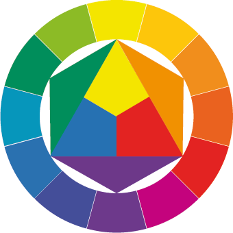
Colour Theory Lecture Part 1

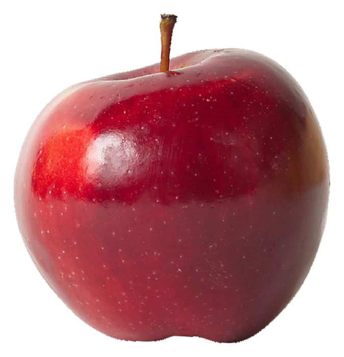
In this colour theory lecture we talked about what colour actually is and how it is created. For example what colour is the apple? But before anyone answered the colour red, we got told that the answer is not actually red but It's just a different shade of red or that we see the apple as red because it's the reddest thing on the screen.
We also talked about what the primary, secondary, and tertiary colours are and where they were on the colour wheel which Johannes Itten does a diagram on in his book "The Art of Colour" Colour works by our brains perceiving colour by light bouncing off any object and entering our eyes, as it penetrates the eye a rainbow of colour is formed.
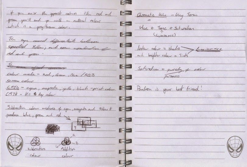
Thats why if you create something in photoshop and then print it out the colour will be different because the photoshop image will be in the colours of RGB, but the colours of the printer will be CMYK.
Tuesday, 17 March 2015
Evaluation- Visual Language
Throughout this Visual Language module I’ve
found that some of the briefs were difficult but also helpful because it
improves your abilities to draw, which to me I feel I need to improve on my
drawing and I also need to keep drawing and just draw where ever I go. For the
Set, Series, Sequence brief I felt like that one wasn’t so hard but the longest
because we had to draw quite a lot of images which related to a word we chose,
but in my opinion I would of liked to do more experimentation within the
drawings especially when it came to the eight images which we had to explore a
rang of ways to draw the same image. I do like my final twelve drawings for it
because I felt like I thought outside the box for the word flight because I did
a free runner running after a man.
The next brief was the environmental story
telling which I did like but again another long one because of the fifteen
images we had to draw. For one of my scenes I was on a cruse so I went to
Brugge (in Belgium) to draw the environment and the architecture, but I did
only do them in pencil because I didn’t have any of my equipment with me so I
would of liked to use colour if I could change it.
In the Take 5 brief I had to listen to
sound and then animate what I heard, which to me was quiet hard because I had
to use my imagination. Most of the sounds were easy to work out like an
explosion. I think that my most successful animation I did was the stop motion
animation made from paper, this is because I felt it was the best one that
represented the sound of a quarry explosion and because I put the most effort
in to it.
For the brief ‘You Spin Me Right Round’ I
drew my beats headphones twelve times in different poses so that when they were
put together the headphones spun round. I did this all digitally because I
prefer it to traditional plus I feel that drawing digitally helps with
colouring and outlining, but I did loose track with the colours I used so half
way through the animation the headphones change colour. If I was to do anything
different to the animation I would make it either black and white or make a
note of what colours I’m using and colour it all again.
For the final brief I had to draw the human
form in many ways like squashing and stretching, walk cycles, and poses. I
found this exercise interesting because of the time limits we had to draw
within, also I feel like some of my drawing have improved and did try and use
different media whilst drawing people. I would of liked to use more watercolors
in the drawings but the paper I was using wasn’t suitable.
Overall I think that my time management was
good because I did nearly everything on time, but in the future modules I would
like to produce a timetable of when I need to do work and for how long I need
to do it of.
Visual Language: Sketchbook

Most of these drawings have been done while I've been at a coffee shop or when we've been at college working .


Visual Language: Animations which Life Drawing / Human Form is Explored

Glen Keane was used to working at 24 frames per second when he was working for disney, but when he was working on the short 'Duet' he was working at 60 frames per second because he was also working with computers and in our days people are used to seeing videos in 60 frames per second. This helped Glen Keane make his transitions from kid to adult so fluid and smooth like, so it doesn't seem unnatural and whats even more impressive is that no technique CGI can manipulate this happen.
Visual Language: Animations Which Life Drawings / Human Form is explored

Visual Language: Animations Which Life Drawing / Human Form is Explored
For the Form, Flow, and Force part of visual language we had to fine animations which life drawing and the human form is explored. So the video above is a behinds the scenes of an animation called 'Thought of You', in this animation it shows two dancers performing to a piece of music and the way the animator made sure the movements were right was that he got two actual dancers to choreograph the dance and preform it so that the animator had something to reference. Ryan Woodward (the animator) created this animation by using the same techniques as traditional animation like layout paper and tracing over the last drawing but slightly changing something, but he was using a computer so that he could add in some effects as well.


One of the things I like about this animation is that the movements that Ryan Woodward had captured looked so realistic but yet not because at one point the male dancer starts moving while his hand and feet are left behind. I also love how the animation helps tell the story between the two animated dancers and how at the end the two dancers change form like the female dancer goes from being a light drawing into an actual real life looking drawing.
Monday, 16 March 2015
Applied Animation: E4 Mood Board
This mood board demonstrates the type of theme of the stop animation I would like to produce, but most of the lego themed sets are either to expensive or they don't make them any more. I thing for the set I might just experiment with different jungle sets and try and buy an Indiana Jones lego man from amazon or something.
 The faces in the mood board are to do with the different kinds of emotions I want the lego man to show while venturing through the tombs. I'm still deciding whether the E4 loge will be made out of lego or not.
Friday, 13 March 2015
Visual Language: Form, Flow, and Force: Strick a Pose

Because it was a 20/30 minute exercise everyone found it easier to sit down on a chair so that they could hold the pose for longer, but I would of like it if someone laid down or stood up just to get a different perspective of the model and human form. I can't complain though because my friend Matt did an interesting pose and when I had to pose I sat down, but I did face the chair the other way round just to mix things up a bit.


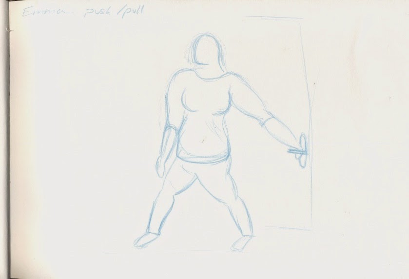
Visual Language: Form, Flow, and Force: Ah, Push It!

As well I used different materials to draw with like red pencil, normal pencil, a blue oil pastil, and a blue pencil. I my opinion the better drawing was done by my oil pastel and red pencil because I feel like I've captured the human form quite well. But for the blue pencil drawing I feel like the proportions are all off so it's not one of my better drawings.


Visual Language: Form, Flow and Force: Like a Puppet on Strings

Throughout the drawings I tried to use different media to draw with like oil pastil, brush pen, ball point pen, and a blue coloured pencil.
 In my opinion I think that some of my drawing are good but some are again out of proportion which can be because there was a time limit on how long the pose had to be which was about 10 seconds.


One thing I did notice about using the brush pen was that if I drew too fast the pen the ink wouldn't come out fast enough so it would leave streaky lines, so I had to go lower to counter act this.


Visual Langauge: Form, Flow, and Force: Rhythm is a Dancer


For this brief we had to draw out someones walk cycle but in only 10 seconds and we had to produce between 12 to 18 drawings of the walk cycle.

 My models were my friends Matt, Lauren, Emma, and Katy who had very weird walking poses which made it harder for me to draw, gut it was fun at the same time.
 Most of the drawings I did I thought were alright but I did rush them so some of them are a bit off like their proportions and body shape. Also I did run out of space for one of the drawings so it just looks like Emma is flying in the drawing.

Thursday, 12 March 2015
Visual Language: Environmental Storytelling Part 3

For the drawings I tried to experiment with the different types of media like pencil, brush pen, outline pen, water colour, and oil pastel. I think Some worked better than others like in my opinion the outlining pen looks better than the water colour costa cup.


Visual language: Environmental Storytelling Part 2

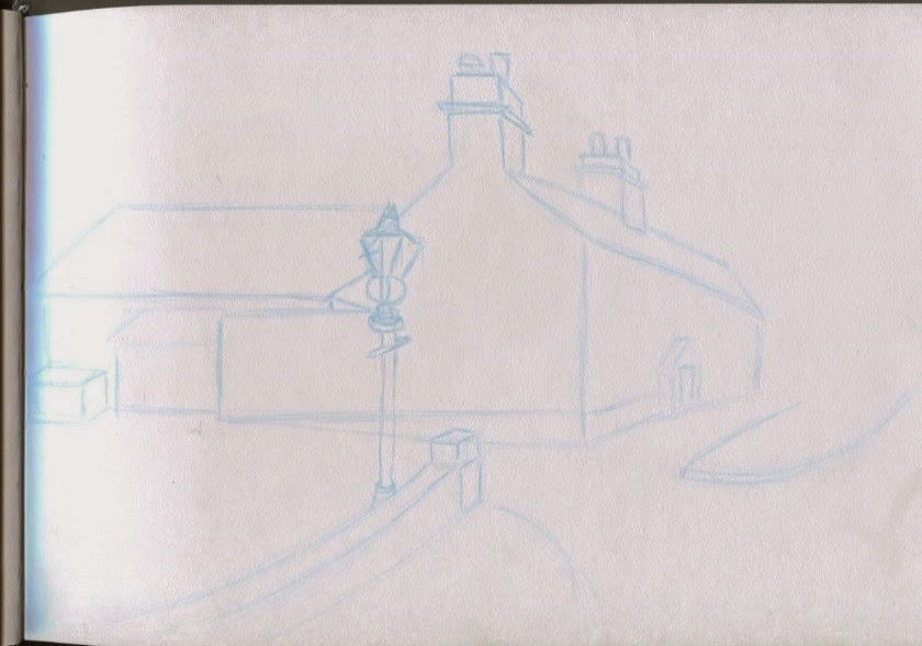
To try and achieve this I sat down on my floor so that I'd get a cool perspectives and for one I tried to get some depth of field in it by drawing from inside of my kitchen but looking into the living room. (see image 4)


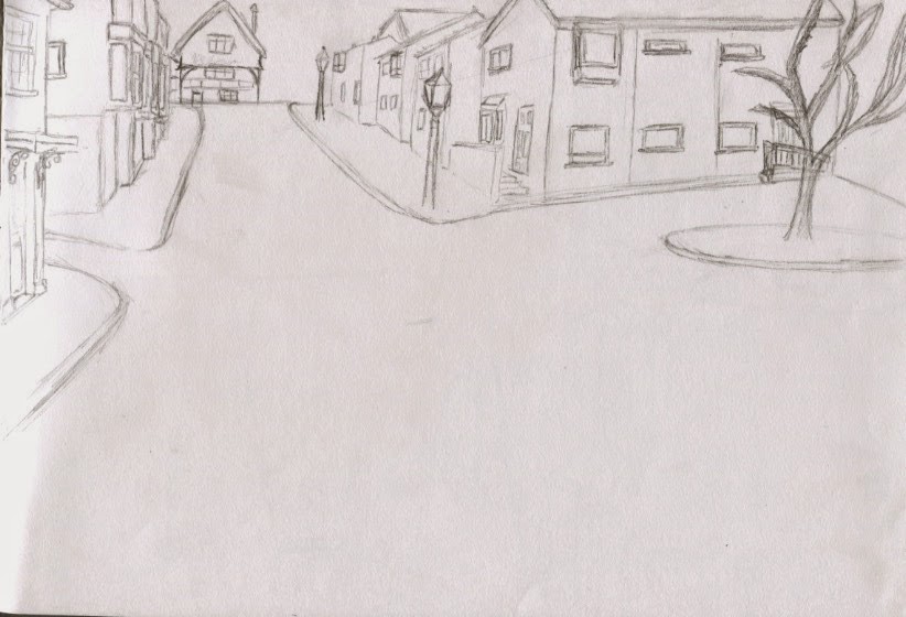
Visual Language: Environmental Storytelling Part 1

All of these drawing are a bit sketchy because I didn't bring most of my equipment with me so I only had a pencil and some colours.
 For most of the landscape I'd tried to capture different angles and perspectives, so like looking up at a building, trying to get the rooftops because some of the architecture was amazing.
Subscribe to:
Comments (Atom)